# @fishies/ui
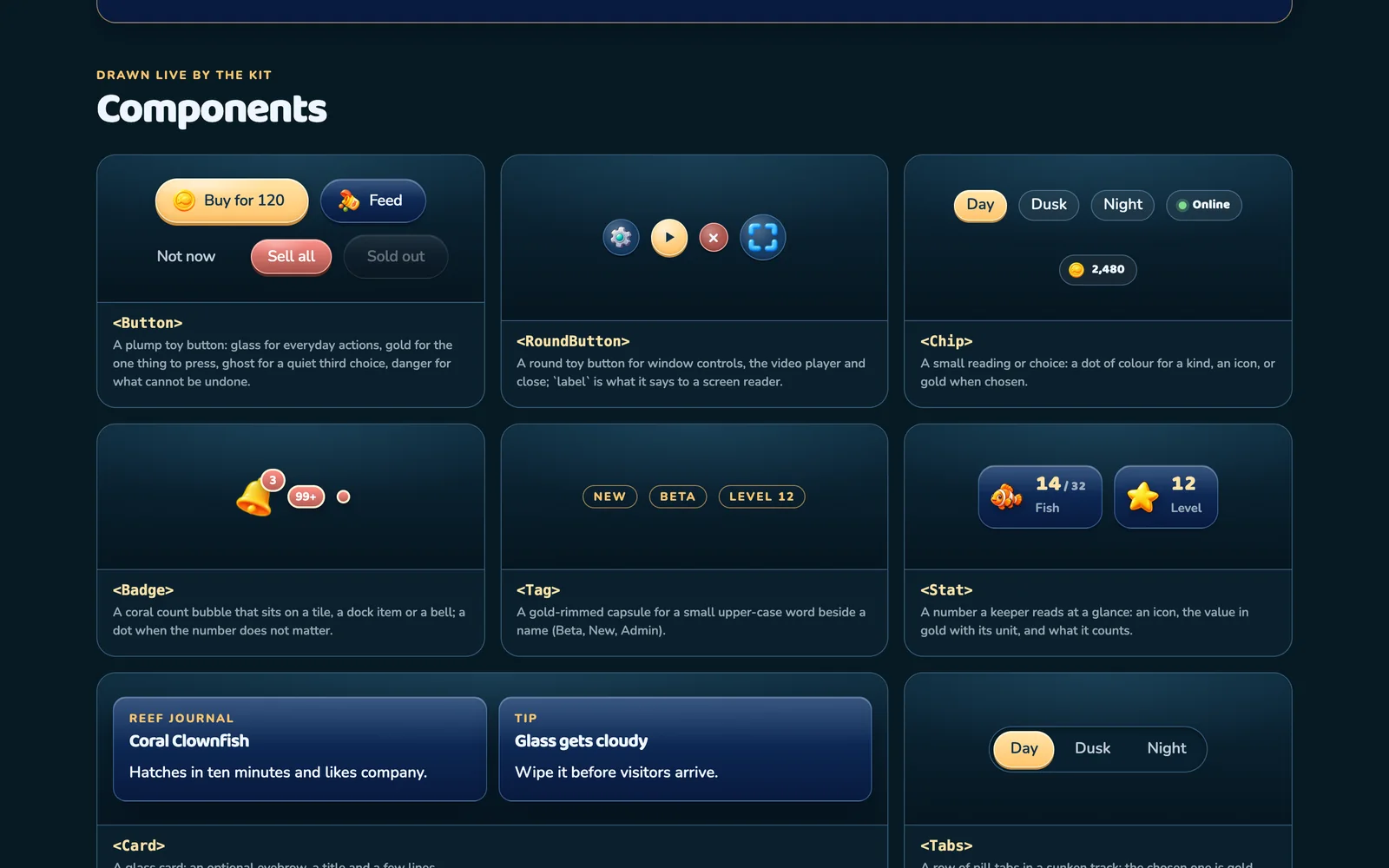
The kit the social aquarium game [Fishies](https://fishies.lol) is drawn with: reef-toy React
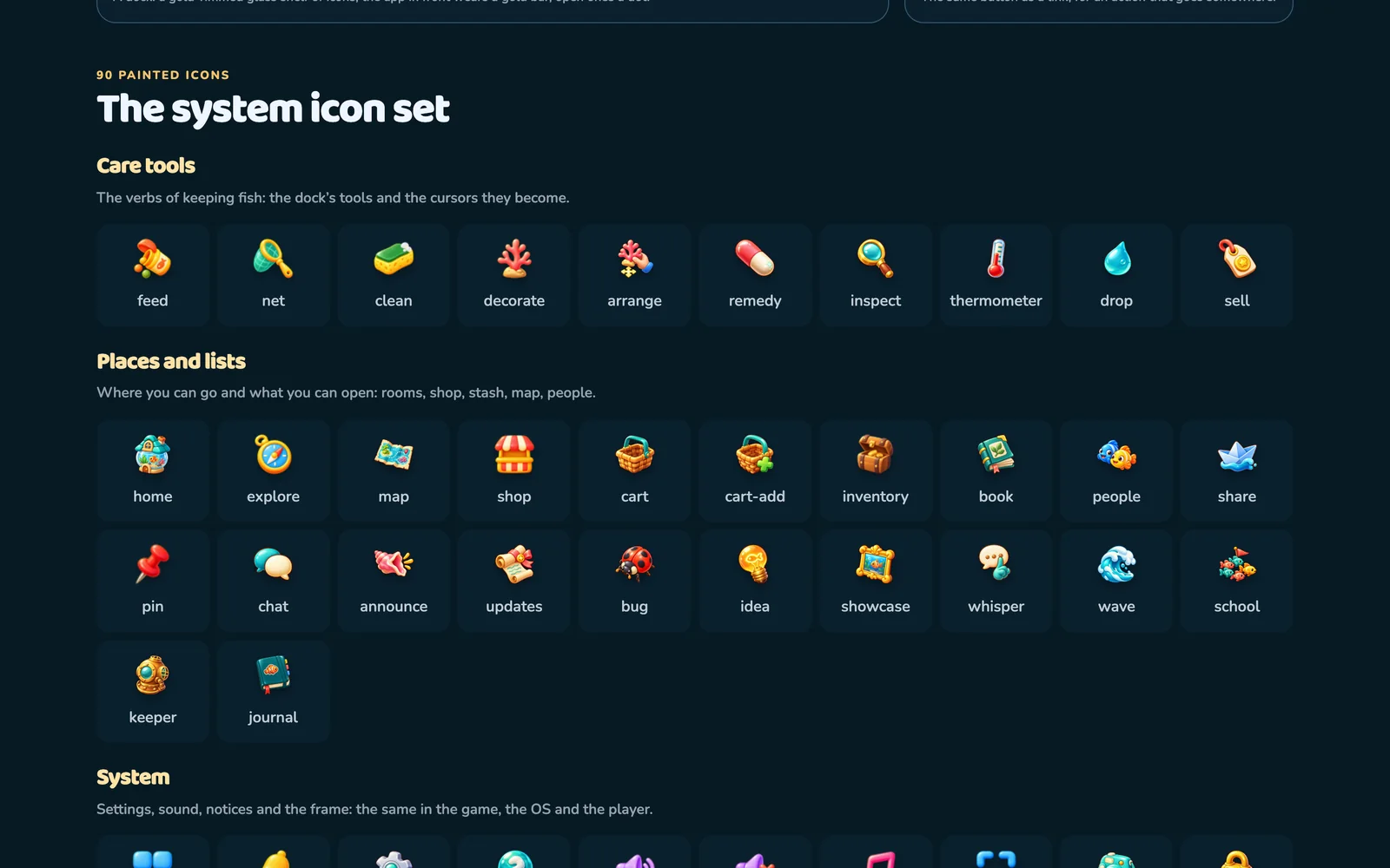
components, design tokens as CSS variables and as data, and the painted system icon set. See every
piece live, with the Fishies Handbook, at **https://fishies.lol/ui**.
```sh
bun add @fishies/ui
```
npm i @fishies/ui · pnpm add @fishies/ui · yarn add @fishies/ui
## Use it
```tsx
import '@fishies/ui/tokens.css' // the --fx-* custom properties
import '@fishies/ui/kit.css' // the components
import { Button, Panel, configureIcons } from '@fishies/ui'
// The icons ship in this package under icons/. Serve that folder, or point at a CDN copy:
configureIcons({ url: icon => `https://cdn.jsdelivr.net/npm/@fishies/ui@0.8.12/icons/${icon.name}.png` })
export function Shop() {
return
}
```
React 18 or newer is a peer dependency. Each component is its own module, so a bundler keeps only
what you import. `Select` and the loader carry their own stylesheets (`@fishies/ui/select.css`,
`@fishies/ui/loader.css`).
The motion tokens (`--m-quick`, `--m-ease-spring` and the rest) are slots: set them, or load a
stylesheet that does, and every component animates with them; leave them out and nothing moves.
## What is in it
| Folder | Holds |
| --- | --- |
| `dist/` | ES modules with type declarations, and the stylesheets |
| `src/` | the same components and tokens as TypeScript source |
| `icons/` | the painted icon set, one PNG per name, each twice its largest display size |
| `handbook/` | the Fishies Handbook as Markdown |
Version 0.8.12: the minor version follows the Fishies release it was taken from; a patch is a fix to the kit itself.